The client aimed to unify quality-improvement tools and real-time practice data into a single, modern portal. The goal was to empower healthcare practices with instant, trustworthy insights and eliminate hours spent on manual reporting.
As Senior UX Designer, I facilitated discovery workshops, conducted moderated user interviews and an unmoderated 34-respondent survey, and delivered personas, user flows, wireframes, high-fidelity mockups, and an interactive prototype.
Role:
Senior UX Designer
Industry:
Healthcare
Tools Used:
Sketch, InVision, Mural, Trello

“I spent half my week emailing spreadsheets back and forth… there’s no one place to go for answers.” – David, Practice Specialist
“I don’t trust the numbers unless they’re right in front of me in a dashboard.” – Anna, Practice Improvement Coach
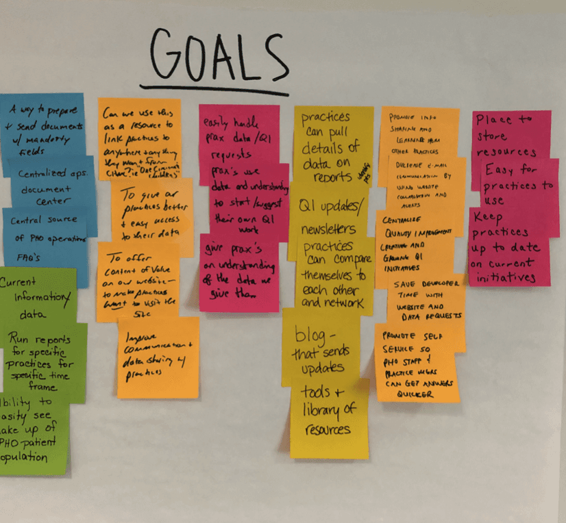
Discovery & Research
Vision Workshop: Aligned leadership on self-service goals, data timeliness, and network-wide resource sharing.
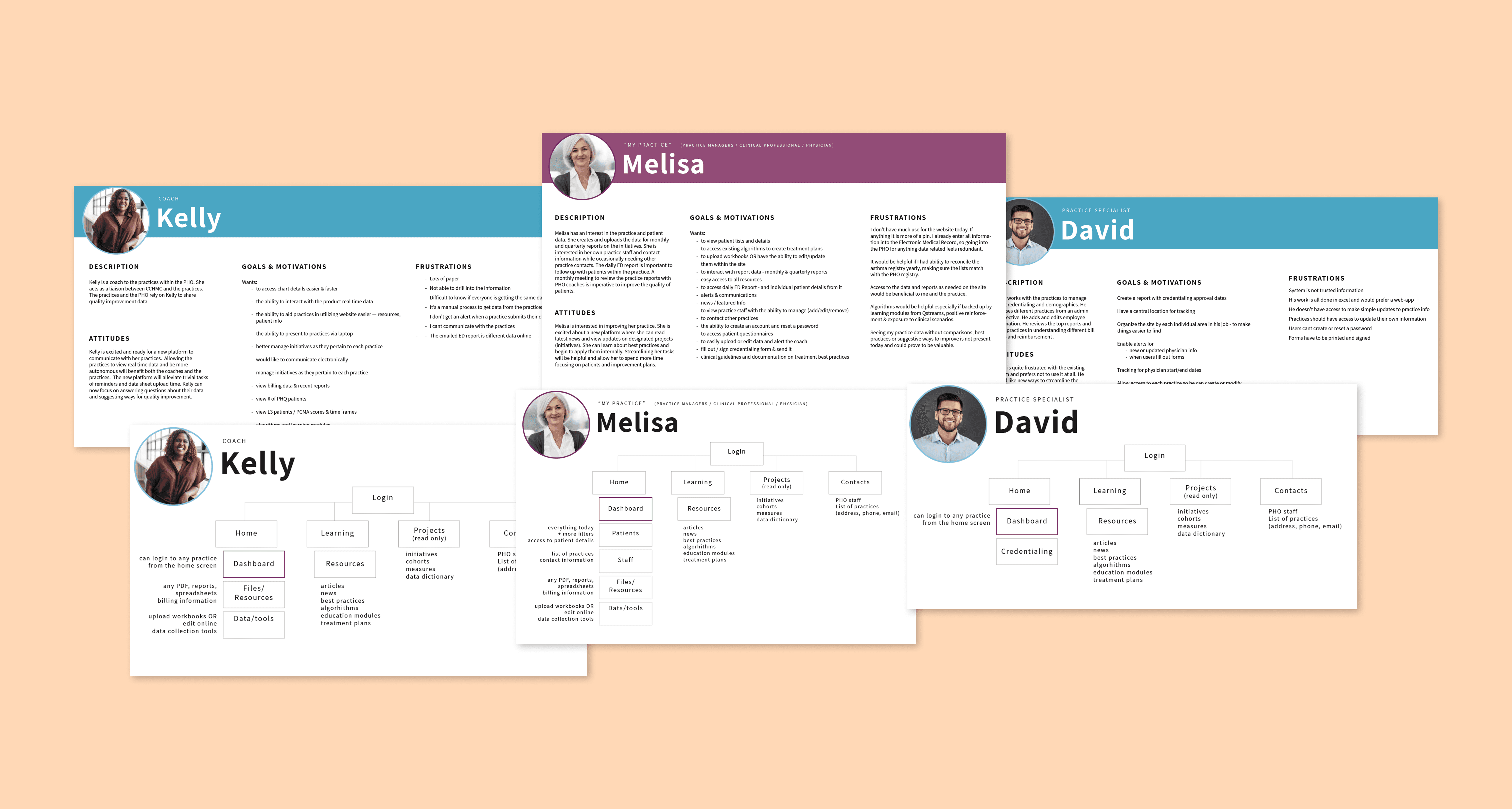
Personas & User Flows: Defined three core roles (Practice Manager, Coach, Specialist) and documented their primary tasks and user flows.
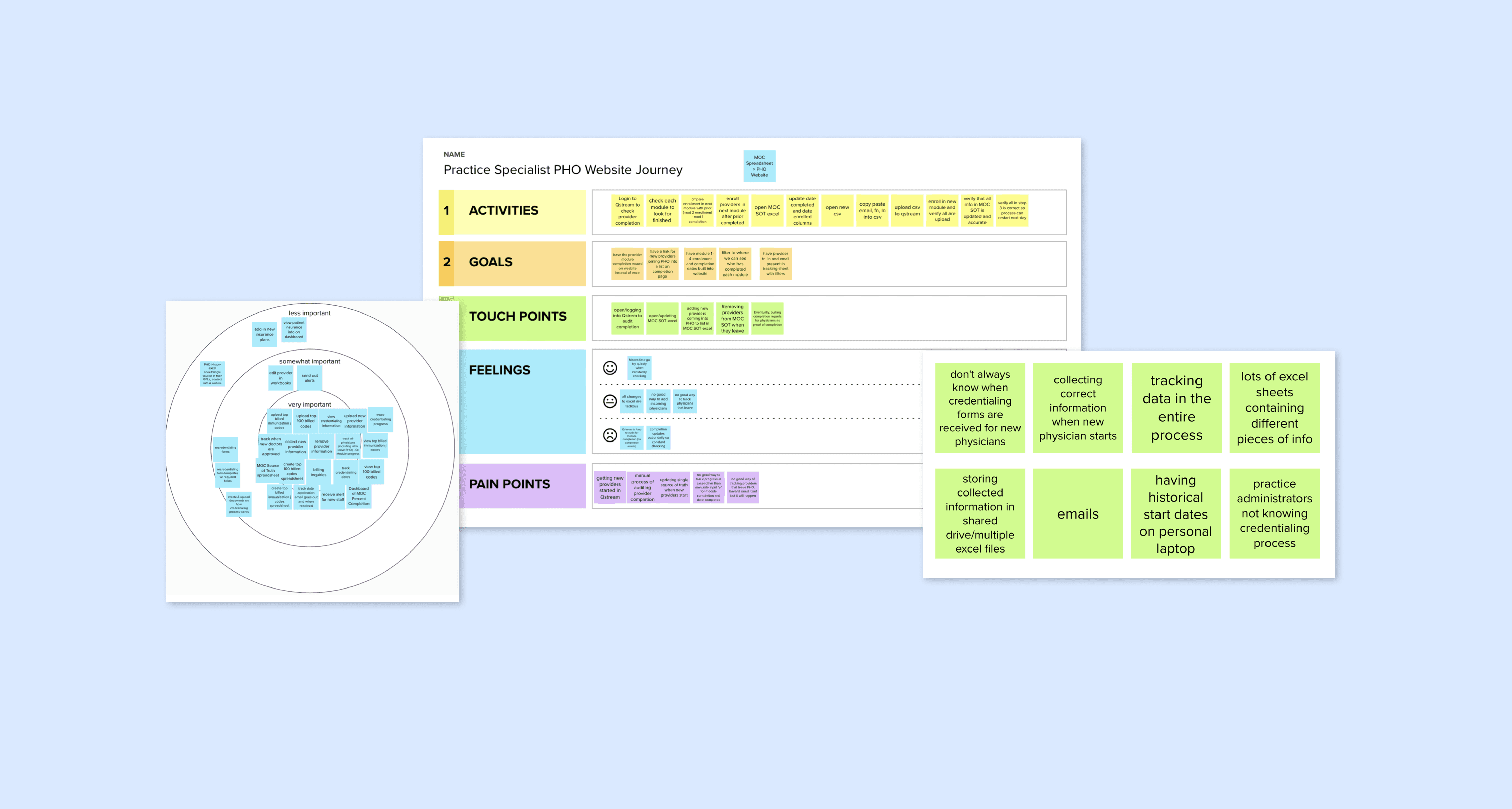
User Interviews: Spoke with practice improvement coaches, specialists, and clinicians to map workflows, pain points, and feature wish lists.
Surveys & Synthesis: Surveyed ~60 users (34 responses) and synthesized findings to prioritize dashboards, workbook entry, and resource-management features.
Solution Vision Statement
"The [Practice Operations Center] is an interactive, streamlined site that manages both quality initiatives and practice needs. Its modern and intuitive interface provides valuable content while delivering accurate data. The functionality promotes self-service and networking which allows practices to provide exceptional patient care."
Research Findings
Dashboard delight: 62% of survey respondents rated the portal’s look & feel as 9–10 out of 10, and 84% “always” or “almost always” found what they needed.
Workbook friction: Several users reported difficulties adding patients to workbooks, highlighting the need for clearer entry controls.
Resource organization: Feedback called for a distinct “Favorites/Resources” section and an FAQ area to surface initiative details and training links.
Findability boost: 64% of users “Almost Always” found what they needed, with another 20% selecting “Always,” confirming strong navigability.

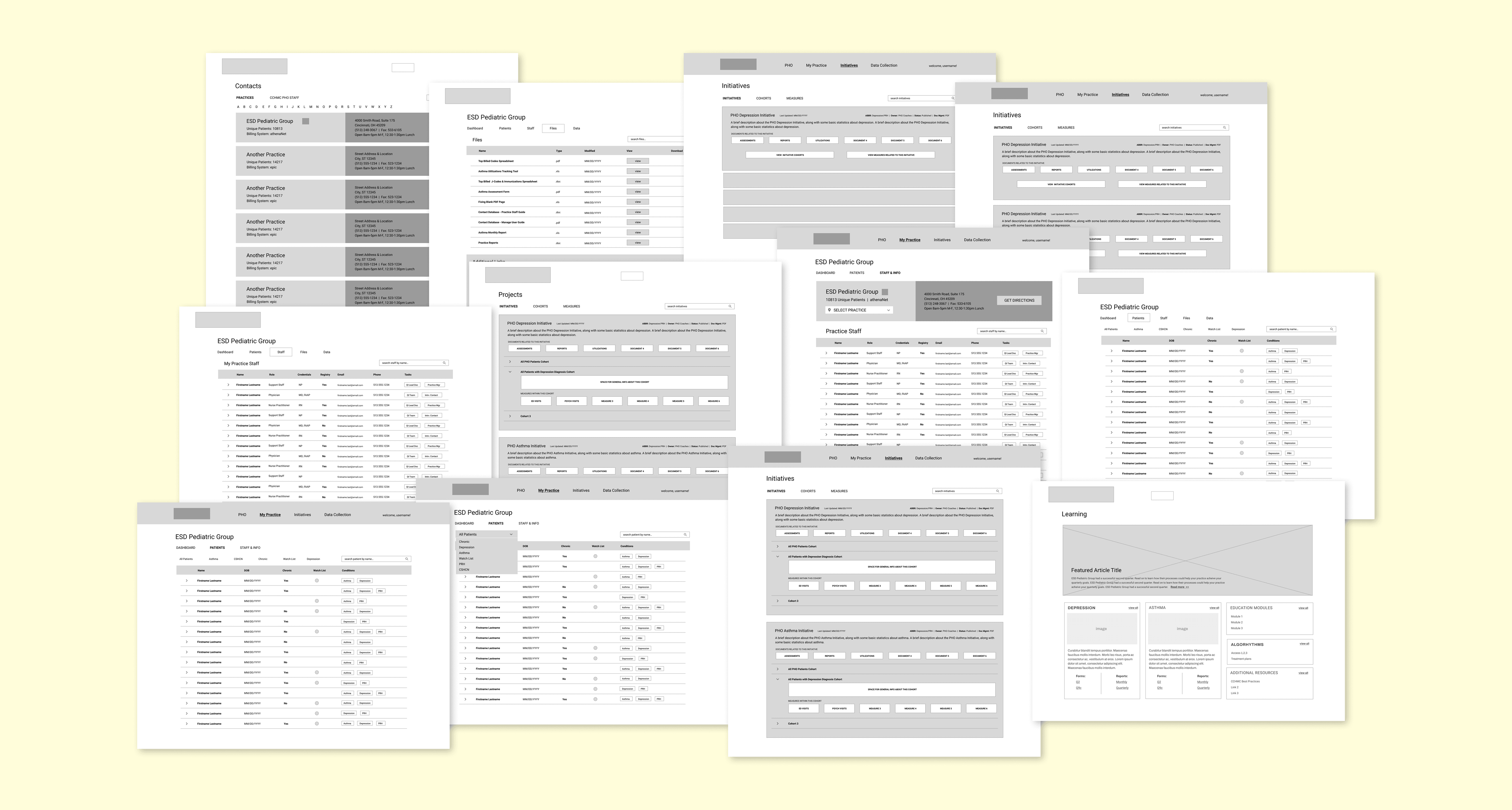
Design & Prototyping
Low-Fidelity Wireframes: Validated information architecture and navigation early, iterating labels and layouts before visual design.
High-Fidelity Mockups: Crafted screens for dashboards, workbooks, and the resource center, then built a clickable InVision prototype for stakeholder walkthroughs.
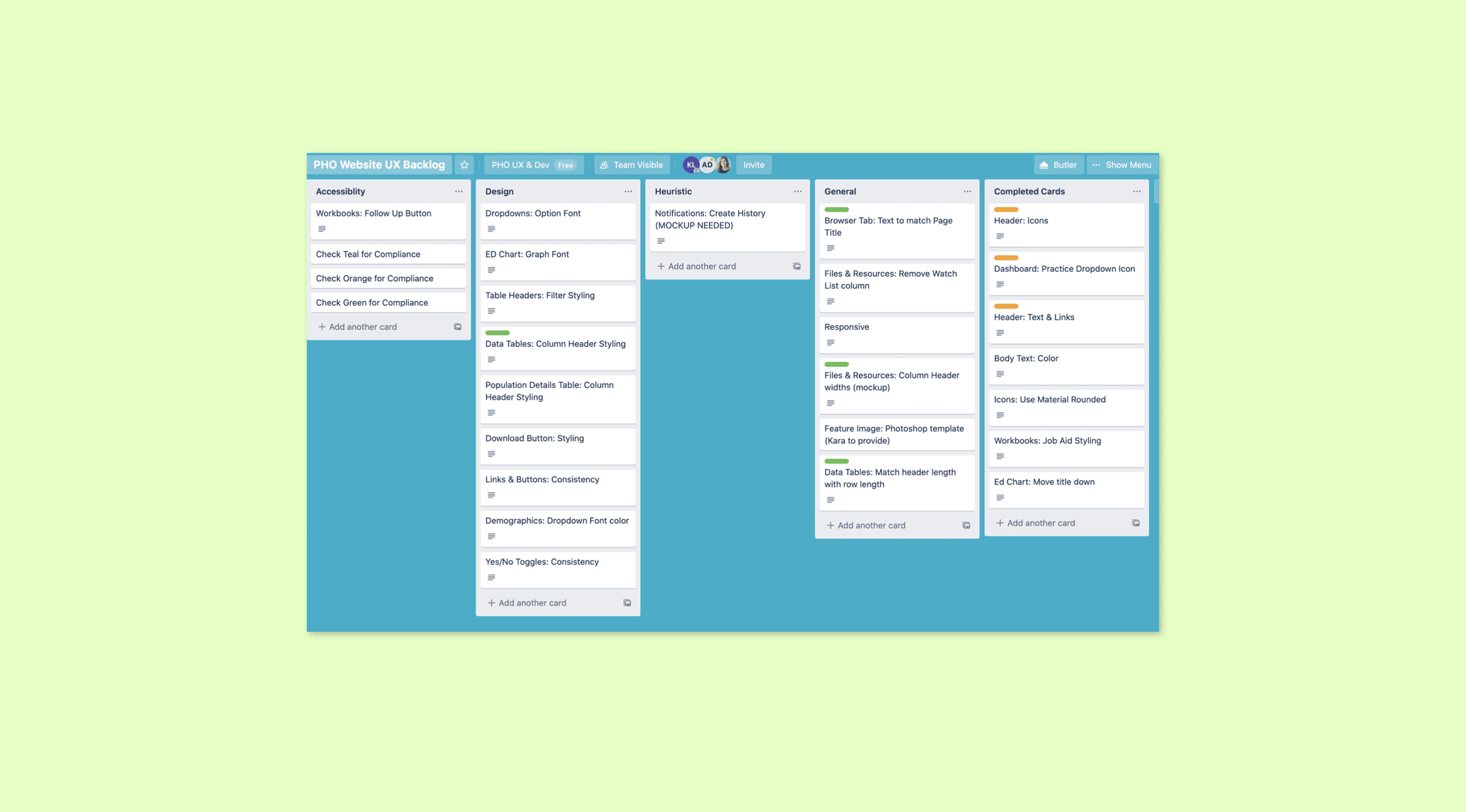
Backlog Prioritization: Sequenced features by impact, prioritizing the ED 12-Day Chart and workbook enhancements over lower-priority items, per the surveyed priorities.
Responsive Refinements: Ensured layouts and charts adapted cleanly from 1280×1024 to 1920×1080 based on device data from the survey.